- A List of Writing Contests in 2022 | Exciting Prizes!
- Em Dash vs. En Dash vs. Hyphen: When to Use Which
- Book Proofreading 101: The Beginner’s Guide
- Screenplay Editing: Importance, Cost, & Self-Editing Tips
- Screenplay Proofreading: Importance, Process, & Cost
- Script Proofreading: Rates, Process, & Proofreading Tips
- Manuscript Proofreading | Definition, Process & Standard Rates
- 14 Punctuation Marks: Examples & Free Guide on How to Use
- Tips to Write Better if English Is Your Second Language
- Novel Proofreading | Definition, Significance & Standard Rates
- The Top 10 Literary Devices: Definitions & Examples
- Top 101 Bone-Chilling Horror Writing Prompts
- Top 10 Must-Try Writing Prompt Generators in 2024
- 100+ Creative Writing Prompts for Masterful Storytelling
- Best 101 Greatest Fictional Characters of All Time
- Top 10 eBook Creator Tools in 2024: Free & Paid
- 50 Timeless and Unforgettable Book Covers of All Time
- What Is Flash Fiction? Definition, Examples & Types
- Best Book Review Sites of 2024: Top 10 Picks
- 80 Enchanting Christmas Writing Prompts for Your Next Story
- Your Guide to the Best eBook Readers in 2024
- Top 10 Book Review Clubs of 2024 to Share Literary Insights
- 2024’s Top 10 Self-Help Books for Better Living
- Writing Contests 2023: Cash Prizes, Free Entries, & More!
- 10 Best Book Writing Apps for Writers: Free & Paid!
- Top 10 Book Marketing Services of 2024: Features and Costs
- Top 10 Book Publishing Companies in 2024
- What Is a Book Teaser and How to Write It: Tips and Examples
- Audiobook vs. EBook vs. Paperback in 2024: (Pros & Cons)
- Top 10 Book Writing Software, Websites, and Tools in 2024
- How to Get a Literary Agent in 2024: The Complete Guide
- Best Fonts and Sizes for Books: A Complete Guide
- Top 10 Book Promotion Services for 2024’s Authors
- Alpha Readers: Where to Find Them and Alpha vs. Beta Readers
- Author Branding 101: How to Build a Powerful Author Brand
- How to Write a Book Report | Steps, Examples & Free Template
- A Guide on How to Write a Book Synopsis: Steps and Examples
- How to Write a Book Review (Meaning, Tips & Examples)
- Book Title Generators: Top 10 Book Name Generators of 2024
- 50 Best Literary Agents in the USA for Authors in 2024
- Building an Author Website: The Ultimate Guide with Examples
- Top 10 Book Printing Services for Authors in 2024
- 10 Best Free Online Grammar Checkers: Features and Ratings
- How to Write a Poem: Step-by-Step Guide to Writing Poetry
- What Is a Poem? Poetry Definition, Elements, & Examples
- Top 10 Paraphrasing Tools for All (Free & Paid)
- 10 Best AI Detector Tools in 2024
- Top 10 Book Editing Software in 2024 (Free & Paid)
- What Is an Adverb? Definition, Types, & Practical Examples
- What Are Large Language Models and How They Work: Explained!
- What Is an Adjective? Definition, Usage & Examples
- Top 10 Hardcover Book Printing Services [Best of 2024]
- 15 Different Types of Poems: Examples & Insight into Poetic Styles
- 2024’s Top 10 Setting Generators to Create Unique Settings
- Different Types of Characters in Stories That Steal the Show
- Top 10 Screenplay & Scriptwriting Software (Free & Paid)
- 10 Best AI Text Generators of 2024: Pros, Cons, and Prices
- Top 10 Must-Try Character Name Generators in 2024
- How to Track Changes in Google Docs: A 7-Step Guide
- 10 Best AI Text Summarizers in 2024 (Free & Paid)
- 2024’s 10 Best Punctuation Checkers for Error-Free Text
- Top 10 AI Humanizers of 2024 [Free & Paid Tools]
- Top 10 AI Rewriters for Perfect Text in 2024 (Free & Paid)
- 10 Best Plot Generators for Engaging Storytelling in 2024
- 11 Best Story Structures for Writers (+ Examples!)
- How to Write a Book with AI in 2024 (Free & Paid Tools)
- Writing Contests 2024: Cash Prizes & Free Entries!
- Patchwork Plagiarism: Definition, Types, & Examples
- 15 Powerful Writing Techniques for Authors in 2024
- Simple Resume Formats for Maximum Impact With Samples
- What Is a Complement in a Sentence? (Meaning, Types & Examples)
- 25 Figures of Speech Simplified with Examples – PaperTrue
- What are Clauses? Definition, Meaning, Types, and Examples
- Persuasive Writing Guide: Techniques & Examples
- How to Paraphrase a Text (Examples + 10 Strategies!)
- 10 Best Translation Services of 2024 (Features Explained)
- 10 Best AI Writing Assistants of 2024 (Features + Pricing)
- Generative AI: Types, Impact, Advantages, Disadvantages
- Top 10 AI Translators for High-Quality Translation in 2024
- Top 10 AI Tools for Research in 2024 (Fast & Efficient!)
- A Simple Proofreading Checklist to Catch Every Mistake
- Top 10 AI Resume Checkers for Job Seekers (Free & Paid)
- 20 Best Comic Book Covers of All Time!
- How to Edit a Book: A Practical Guide with 7 Easy Steps
- How to Write an Autobiography (7 Amazing Strategies!)
- 100+ Amazing Short Story Ideas to Craft Unforgettable Stories
- How to Publish a Comic Book: Nine Steps & Publishing Costs
- Passive and Active Voice (Meaning, Examples & Uses)
- How to Publish a Short Story & Best Publishing Platforms
- Top 10 Book Distribution Services for Authors in 2024
- 50 Best Essay Prompts for College Students in 2024
- What Is Expository Writing? Types, Examples, & 10 Tips
- 10 Best Introduction Generators (Includes Free AI Tools!)
- Creative Writing: A Beginner’s Guide to Get Started
- How to Sell Books Online (Steps, Best Platforms & Tools)
- What is a Book Copyright Page?
- Final Checklist: Is My Article Ready for Submitting to Journals?
- 8 Pre-Publishing Steps to Self-Publish Your Book
- 7 Essential Elements of a Book Cover Design
- How to Copyright Your Book in the US, UK, & India
- How to Format a Book in 2024: 7 Tips for Print & EBooks
- Beta Readers: Why You Should Know About Them in 2024
- How to Publish a Book in 2024: Essential Tips for Beginners
- ISBN Guide 2024: What Is an ISBN and How to Get an ISBN
- Book Cover Design Basics: Tips & Best Book Cover Ideas
- Why and How to Use an Author Pen Name: Guide for Authors
- How to Hire a Book Editor in 5 Practical Steps
- Self-Publishing Options for Writers
- How to Promote Your Book Using a Goodreads Author Page
- 7 Essential Elements of a Book Cover Design
- What Makes Typesetting a Pre-Publishing Essential for Every Author?
- 4 Online Publishing Platforms To Boost Your Readership
- Typesetting: An Introduction
- Quick Guide to Novel Editing (with a Self-Editing Checklist)
- Quick Guide to Book Editing [Complete Process & Standard Rates]
- 10 Best Self-Publishing Companies of 2024: Price & Royalties
- Self-Publishing vs. Traditional Publishing: 2024 Guide
- How to Publish a Book in 2024: Essential Tips for Beginners
- ISBN Guide 2024: What Is an ISBN and How to Get an ISBN
- How to Publish a Book on Amazon: 8 Easy Steps [2024 Update]
- 10 Best Book Cover Design Services of 2024: Price & Ratings
- A Beginner’s Guide to Self-Publishing a Book in 2024
- Learn How Much Does It Cost to Self-Publish a Book in 2024
- What are Print-on-Demand Books? Cost and Process in 2024
- What Are the Standard Book Sizes for Publishing Your Book?
- Top 10 EBook Conversion Services for 2024’s Authors
- How to Copyright a Book in 2024 (Costs + Free Template)
- How to Market Your Book on Amazon to Maximize Sales in 2024
- Top 10 Hardcover Book Printing Services [Best of 2024]
- How to Find an Editor for Your Book in 8 Steps (+ Costs!)
- What Is Amazon Self-Publishing? Pros, Cons & Key Insights
- Manuscript Editing in 2024: Elevating Your Writing for Success
- Know Everything About How to Make an Audiobook
- A Simple 14-Point Self-Publishing Checklist for Authors
- How to Write an Engaging Author Bio: Tips and Examples
- Book Cover Design Basics: Tips & Best Book Cover Ideas
- How to Publish a Comic Book: Nine Steps & Publishing Costs
- Why and How to Use an Author Pen Name: Guide for Authors
- How to Sell Books Online (Steps, Best Platforms & Tools)
- A Simple Guide to Select the Best Self-Publishing Websites
- How to start your own online publishing company?
- 8 Tips To Write Appealing Query Letters
- Self-Publishing vs. Traditional Publishing: 2024 Guide
- How to Publish a Book in 2024: Essential Tips for Beginners
- ISBN Guide 2024: What Is an ISBN and How to Get an ISBN
- What are Print-on-Demand Books? Cost and Process in 2024
- Top 10 Book Publishing Companies in 2024
- How to Write a Query Letter (Examples + Free Template)
- Third-person Point of View: Definition, Types, Examples
- How to Write an Engaging Author Bio: Tips and Examples
- How to Publish a Comic Book: Nine Steps & Publishing Costs
- How to Create Depth in Characters
- Starting Your Book With a Bang: Ways to Catch Readers’ Attention
- How to Write a Powerful Plot in 12 Steps
- Research for Fiction Writers: A Complete Guide
- Short stories: Do’s and don’ts
- How to Write Dialogue: 7 Rules, 5 Tips & 65 Examples
- How to Write a Novel in Past Tense? 3 Steps & Examples
- What Are Foil and Stock Characters? Easy Examples from Harry Potter
- How To Write Better Letters In Your Novel
- On Being Tense About Tense: What Verb Tense To Write Your Novel In
- How To Create A Stellar Plot Outline
- How to Punctuate Dialogue in Fiction
- On Being Tense about Tense: Present Tense Narratives in Novels
- The Essential Guide to Worldbuilding [from Book Editors]
- What Is Point of View? Definition, Types, & Examples in Writing
- How to Create Powerful Conflict in Your Story | Useful Examples
- How to Write a Book: A Step-by-Step Guide
- How to Write a Short Story in 6 Simple Steps
- How To Craft a Murder Mystery Story
- How to Write a Novel: 8 Steps to Help You Start Writing
- What Is a Stock Character? 150 Examples from 5 Genres
- How to Write a Children’s Book: An Easy Step-by-Step Guide
- Joseph Campbell’s Hero’s Journey: Worksheet & Examples
- Novel Outline: A Proven Blueprint [+ Free Template!]
- Character Development: 7-Step Guide for Writers
- Foil Character: Definition, History, & Examples
- What Is NaNoWriMo? Top 7 Tips to Ace the Writing Marathon
- What Is the Setting of a Story? Meaning + 7 Expert Tips
- Theme of a Story | Meaning, Common Themes & Examples
- 5 Key Elements of a Short Story: Essential Tips for Writers
- What Is a Blurb? Meaning, Examples & 10 Expert Tips
- What Is Show, Don’t Tell? (Meaning, Examples & 6 Tips)
- How to Write a Book Summary: Example, Tips, & Bonus Section
- How to Write a Book Description (Examples + Free Template)
- 10 Best Free AI Resume Builders to Create the Perfect CV
- A Complete Guide on How to Use ChatGPT to Write a Resume
- 10 Best AI Writer Tools Every Writer Should Know About
- 15 Best ATS-Friendly ChatGPT Prompts for Resumes in 2024
- What Is an Adverb? Definition, Types, & Practical Examples
- How to Write a Book Title (15 Expert Tips + Examples)
- What Is an Adjective? Definition, Usage & Examples
- 10 Best AI Story Generators in 2024
- 100 Novel and Book Ideas to Start Your Book Writing Journey
- Exploring Writing Styles: Meaning, Types, and Examples
- Mastering Professional Email Writing: Steps, Tips & Examples
- How to Write a Screenplay: Expert Tips, Steps, and Examples
- Business Proposal Guide: How to Write, Examples and Template
- Different Types of Resumes: Explained with Tips and Examples
- How to Create a Memorable Protagonist (7 Expert Tips)
- How to Write an Antagonist (Examples & 7 Expert Tips)
- Writing for the Web: 7 Expert Tips for Web Content Writing
- 10 Best AI Text Generators of 2024: Pros, Cons, and Prices
- What are the Parts of a Sentence? An Easy-to-Learn Guide
- How to Avoid AI Detection in 2024 (6 Proven Techniques!)
- How to Avoid Plagiarism in 2024 (10 Effective Strategies!)
- 10 Best Spell Checkers of 2024: Features, Accuracy & Ranking
- What Is Climax Of A Story & How To Craft A Gripping Climax
- What Is a Subject of a Sentence? Meaning, Examples & Types
- Object of a Sentence: Your Comprehensive Guide
- What Is First-Person Point of View? Tips & Practical Examples
- Second-person Point of View: What Is It and Examples
- 10 Best AI Essay Outline Generators of 2024
- Third-person Point of View: Definition, Types, Examples
- The Importance of Proofreading: A Comprehensive Overview
- Patchwork Plagiarism: Definition, Types, & Examples
- Simple Resume Formats for Maximum Impact With Samples
- The Ultimate Guide to Phrases In English – Types & Examples
- Modifiers: Definition, Meaning, Types, and Examples
- What are Clauses? Definition, Meaning, Types, and Examples
- Persuasive Writing Guide: Techniques & Examples
- What Is a Simile? Meaning, Examples & How to Use Similes
- Mastering Metaphors: Definition, Types, and Examples
- 10 Best AI Writing Assistants of 2024 (Features + Pricing)
- Generative AI: Types, Impact, Advantages, Disadvantages
- How to Publish a Comic Book: Nine Steps & Publishing Costs
- Essential Grammar Rules: Master Basic & Advanced Writing Skills
- Benefits of Using an AI Writing Generator for Editing
- Hyperbole in Writing: Definition and Examples
Still have questions? Leave a comment
Checklist: Dissertation Proposal
Enter your email id to get the downloadable right in your inbox!
Examples: Edited Papers
Enter your email id to get the downloadable right in your inbox!
Need
Editing and
Proofreading Services?

7 Essential Elements of a Book Cover Design
 Aug 30, 2022
 7
min read
- Tags: Book Cover Design, Self-Publishing
One deciding factor in making a book a best-seller—out of the thousands available at a bookstore—is its book cover design. Some classics can be recognized to this day by their iconic covers alone (for example: The Godfather by Mario Puzo). So, what ideas for book covers can you use to captivate the attention of any reader who comes knocking?
Why is book cover design important?
A book cover tells your readers what to expect from your book. It makes readers stop their stroll through the bookstore and pause in front of your book. It directs them from various corners of the internet to your Goodreads profile or website, or your book’s Amazon retail page. So, a book cover is also an essential marketing tool!
But before you begin to dream of bestselling book cover designs, you need to find a designer. Before you go looking for this designer, you need to learn how to brief one about a particular design. And before this, you need to be well-versed in what the basic parts of a book cover design are.
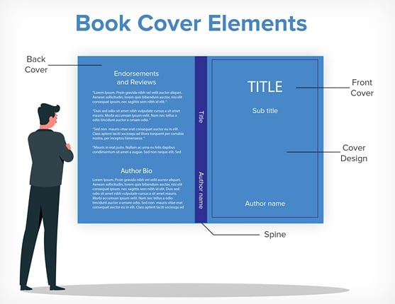
Let’s get straight to it, then. Here are the seven essential elements of a book cover design:
1. A riveting title for the book
You may have googled “ideas for book covers” in hopes of design inspirations, but things like the title, the subheading, and author bio are essential parts of a book cover! Take any book cover example: aren’t your eyes drawn to the title first?
Your book title is the first text piece a reader will look at when they stop to consider your book. Obviously, it needs to be cleverly devised.
A title should be easy to read and easy to remember. Remember, you’re designing a cover for potential readers, which means you need to be as direct and straightforward in your title as possible. This gets even more important for a nonfiction book cover.
In a book title, clarity and directness are often as important as wit and intrigue.
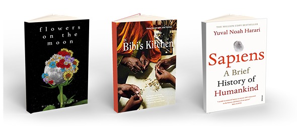
Let’s take a look at some book cover examples:

2. An evocative subtitle
In the book covers above, do you notice how the title is always accompanied by a smaller line of text? That is the subtitle. It provides additional information about your book through a clear line that complements the book title.
If the title is the hook that draws eyes to your book, the subtitle should finish the job. It should make people want to pick up your book and study it further.
A great subtitle gives more context to an otherwise obscure title and adds some new information to it. In Siddhartha Mukherjee’s The Emperor of All Maladies, for example, the title is intriguing but obscure. It is the subtitle that offers a short but effective clarification, in the phrase “a short biography of cancer.”

You can also observe how the subtitles for A Brief History of Time and The Korean Vegan Cookbook provide more information about the books.
3. Interesting typography
Typography is the part of book cover design that highlights your title and subtitle, making them stand out. Great ideas for book covers always translate the central theme of the book through the typography.
It helps to keep the genre in mind while deciding upon the font and style for your book. Nonfiction and self-help books benefit from a modern font while books in the fantasy genre can afford elaborate fonts. Let’s take a look at the following book cover examples:
As you can see, words can also be turned into shapes. The mark of a great cover designer is their ability to combine cover art and the words on the cover into one coherent whole.
4. Coherent cover design and layout
Book cover design layout is the perfect blend of typography and imagery, the most important parts of a book cover design. It communicates the single message you want to give your readers when they buy your book. For this, it is crucial that you have a perfect understanding of your target audience. You need to know exactly who you’re selling to, so you can determine how you’ll be selling to them.
A good cover design layout will leave a clear idea of your book in the reader’s mind. Once you know what this idea is, you can decide on colors, images, and font types that complement it. If you’re crafting a mystery, a large, foreboding title with shadowy images is a fairly standard cover prototype. In the case of romances, bright colors and happy images are the way to go. No matter your specific case, you need to make sure that all elements on the cover work together.
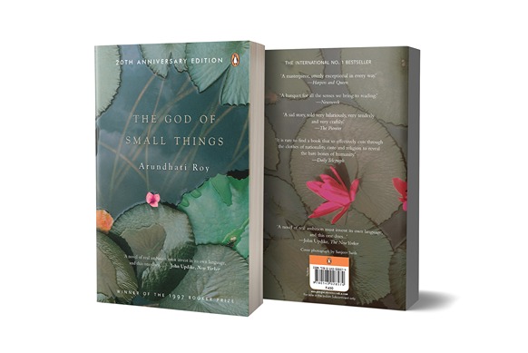
Here are a few self-explanatory examples as to why the following cover design and layouts work in the book’s favor:
5. Endorsements and reviews
In the digital world, reviews and ratings appear right alongside your book’s entry, on any retailing service. But in the case of printed books, you don’t have scores of reviews readily available. Here, reviews are printed over the front and back cover as a mark of quality.
“Blurbs”, as they are called, go on the front and back of the cover. These are the reviews by prominent critics, authors, or newspapers that help you sell more copies. Positive comments made by these reviewers can be printed on the cover. They act as social proof to validate your book.
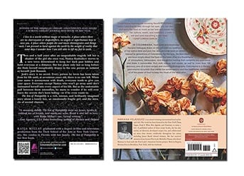
Usually, the shorter reviews appear on the front cover of a book while longer, detailed ones appear on the back. Here’s a handy back cover example:
6. A well-placed author bio
Whenever they’re looking at a book, readers instinctively want to know the author. The author bio is printed on the back cover to serve this purpose. It tells your future readers about who you are as a writer. It’s usually about three sentences long and is accompanied by information on where the readers can find you online, such as your blog or website address.
What you mention here also depends on your genre. If you’re a fiction writer, it helps to establish an author persona. If your book is nonfiction, you’re better off presenting yourself as an expert in your subject. Mention your credentials and other work in this specific field.
An author bio helps you market yourself and establish an author brand. While selling your book, you’re also selling yourself as a talented writer.
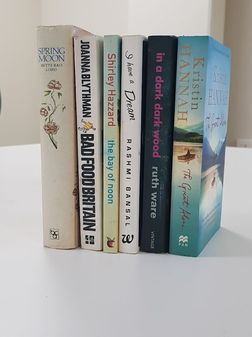
7. An eye-catching spine
It’s a luxury to have your book extensively marketed and stacked tall in any given bookstore. Sadly, this is not the case for self-published writers. Your book will probably have to share space with its genre rivals on a bookshelf, with only its spine for display. If this small space is to capture the readers’ eyes, it must be striking.
The spine is cohesive with the design and theme of the entire cover. The choice of text here is particularly crucial. Remember, the spine of a book only features the title, the author’s name, and maybe the logo of your publishing company, if you’re going the traditional route.
Here are some interesting examples:
All the great ideas for book covers use these seven parts to make up one brilliant whole. Be sure to use them well, because having a great book cover design is an essential step to book marketing!
Designing book covers is also included in PaperTrue’s self-publishing services. If you wish to design a book cover, we’d love to help you! Here are some other articles you might find useful:




Informative article and a great choice of book cover examples!
I love the examples you gave me